-
The most important factor in the 2016 election? Student loans.
If you took all 3,113 counties in the United States, and wanted to try and guess whether a county would cast more votes for Hillary Clinton or Donald Trump, the most important pieces of information to have be the number of people who claim an education-related deduction or credit.
This finding on student loans is part of my ongoing analysis of the intersection of 2016 voting behavior and tax return information.
More methodology
This analysis was performed using a random forest classifier, which used 124 variables drawn from county-level 2014 IRS data. Variables included aggregate totals and participant counts for each income type and deduction. The dataset was matched by county with the New York Times report of election night votes. Average cross-validated accuracy score using the model's classification was approximately 0.89 (good!) and an F1 score of 0.88 (not bad!).
To be sure, these groups of voters are qualitatively different in other measurable ways. For instance, the number of farm returns in a county is the next-most impactful feature in the income dataset behind education credits and deductions. Counties with the highest numbers of these returns were the most likely in the data to cast more returns for Trump than Clinton.But these findings largely conform to the behaviors we might expect of the electorate. Those with higher levels of education (especially those at high-cost liberal arts colleges) are most likely to inhabit counties that vote for Clinton. Farmers were more likely to vote Trump.
Perhaps more interesting are the distinctions that weren’t found in the dataset. Most importantly, total taxable income did not emerge as an especially valuable predictor.
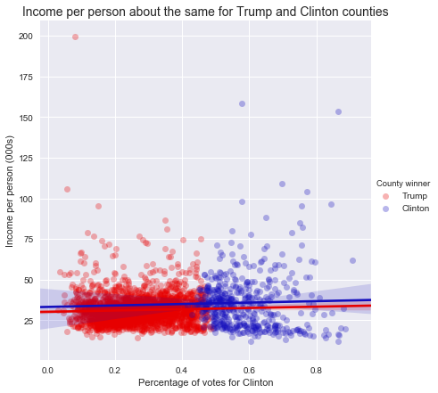
The figure above demonstrates the distribution of income, as separated by Clinton’s margin over Trump (or vice versa). Each blue dot represents a county in which more people voted for Clinton than Trump, and each red dot shows a county with more Trump votes.
While the sheer numbers for the Trump voters are significantly greater - Trump won about 84 percent of US counties - the distribution of incomes is relatively similar between them.
-
Hillary Clinton won the taxpayer vote and other Tax Day findings
Happy (?) Tax Day, everyone.
In honor of Tax Day, I wanted to do a small piece of analysis on the way taxpayers voted in the 2016 election. Here are a couple of brief headlines:
- Hillary Clinton won among those who filed tax returns in 2015.
- Donald Trump won the vast majority of counties, winning 2,623 counties to Clinton’s 490, or about 84%.
- Of the counties that had the highest proportion of votes for independent candidates, 12 of the top 15 are in Utah (the other three are in Idaho), likely a function of the independent candidacy of Evan McMullin, a member of the Mormon church in Utah.
- Counties with the highest total gross income per capita include a small town of 499 voters in Texas called McMullen, of whom Trump won 454 votes. Manhattan, NY also cracks the top 3, and voted for Clinton with 87 percent of the vote.
- The poorest counties also voted heavily for Clinton. Three counties on South Dakota reservations, and one county in Mississippi all voted for her by margins of at least 3-to-1.
Here is a graphic of the overall margin by county, according to data on county-level vote from the New York Times.
A short note on methodology and assumptions:
- Income calculations is based on IRS county-level data from taxes filed for the year 2014 (those typically due by April 15, 2015).
- Taxpayer-level calculations were conducted by assuming that within a county, taxpayers and non-taxpayers voted at the same rate. Thus, to find the number of taxpayers voting for Clinton within a county, this analysis multiplied Clinton’s margin in that county by the total number of tax returns for the county.
-
#mood

-
Overfitting the Sweet 16
I have a very simple model for about a quarter of my NCAA bracket predictions: if UNC, move to next round.
This year, that model has worked pretty well.
But unfortunately, it only helps you out in a few circumstances. Every pick is UNC, which is useful when UNC plays Butler, but not so much when Michigan plays Oregon. So since it gives you the same output every time, no matter who is playing, statisticians and data scientists would say this model has low variance.
This is isn’t very useful for the broader world of NCAA tournament basketball, so we need a more complex model, one that describes more teams. But here’s the problem a lot of people have in building models: they use everything they know. Let me explain.
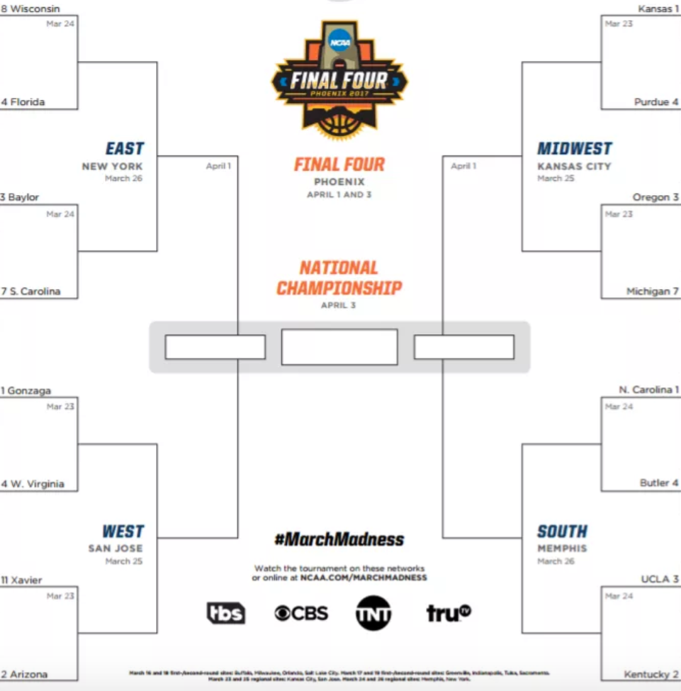
Here is the bracket of the Sweet 16 games:
Since we currently live in a world where we know who won the Sweet 16 games, we can make a super accurate model to “predict” the winners of those games. It might look like this:
- If UNC is playing, pick UNC (this is my model, after all)
- If a school has multiple NCAA championships over the last 20 years, pick it if it has more than the other school
- In a contest between schools in states near large bodies of saltwater and freshwater, pick saltwater
- If teams are both from the Confederacy, pick the eastern-most team
- If a school has an X in its name, pick it (Xs are cool)
- If all else fails, chalk (i.e., pick the team with the lower seed)
And we’ll say that these are applied in this order, so that the 1st element of the model trumps the 2nd and so on.
Here is how our picks look for the Sweet 16. It’s a weird model, but I’ve got a good feeling about it.
Factor Factor Description Team Picked 1. Pick UNC UNC 2. NCAA champions Florida, Kentucky 3. Saltwater over freshwater Florida, Oregon 4. Easternmost Confederate S. Carolina 5. Has an X Xavier 6. Chalk Kansas, Gonzaga How’d we do?
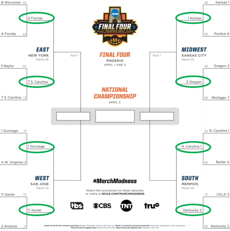
Crushed it.
We got them all right! We are 100% accurate. This is the best model of all time. So we confidently deploy it to predict the winners of the Elite Eight who will move on to the Final Four.
Factor Factor Description Team Picked 1. Pick UNC UNC 2. NCAA champions Florida 3. Saltwater over freshwater N/A, freshwaters already eliminated 4. Easternmost Confederate N/A, Florida already picked 5. Has an X Xavier 6. Chalk Kansas And just as we suspected…
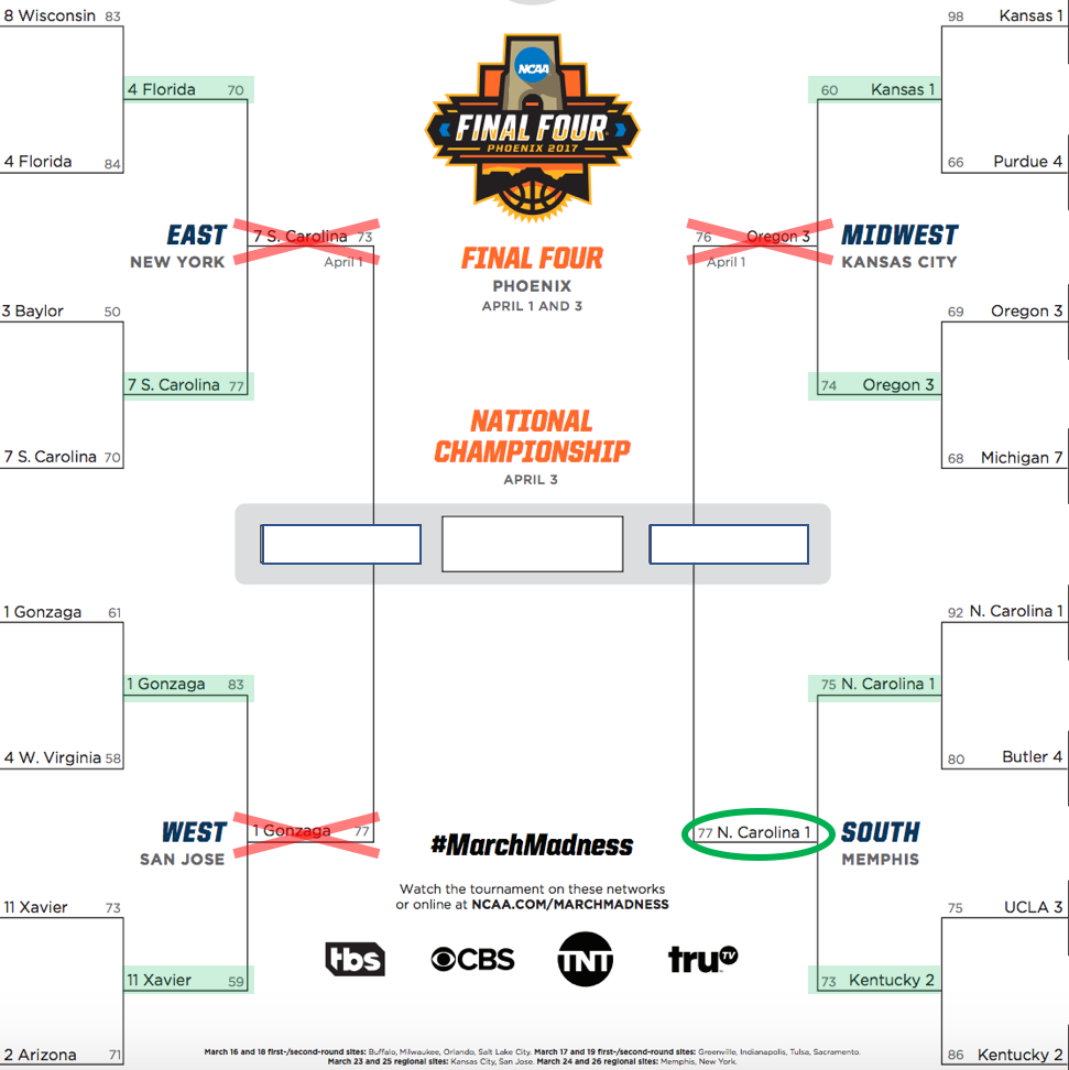
Wait what?
The only school we got right here was UNC, giving our model an accuracy rate of 25%. Dang.
What went wrong?
When we went to create a model, we focused on hitting all the points we knew we needed to hit, which statisticians and data scientists refer to as having high bias.
This is a big problem in data science, known as “overfitting.” All that means is that predictions overly closely predict the original dataset, and aren’t flexible enough to be applied in the world.
So in summary: predictive accuracy comes at a tradeoff, called bias. Simpler models minimize this bias, but run into limitations to accuracy due to low variance. Good models are those that minimize both aspects of this.
And Go Heels.
-
Who's that Lady?
Let’s say you’re at a local dog park in DC, and you see a dog chasing a ball, doing dog things, and you want to call out for her to come play with you. What should you yell?
Try “Lady” or “Blue.”

According to a list of 1,533 dog registrations in the District in 2016, those are most likely names for female and male dogs, respectively. Here are other common pup names.
Good Boys # Good Girls # Blue 10 Lady 14 King 8 Chloe 11 Rocky 7 Bella 10 Charlie 6 Sheba 7 Nino 6 Princess 6 Max 6 Lola 6 Zeus 6 Sasha 6 Rambo, my favorite name on this list, is shared by four lucky dogs. Those who enjoy trademark infringement may consider “Oreo,” which is shared by five males and one female.
So what else do we know about these dogs?
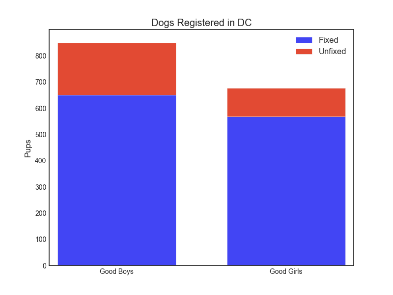
For starters, they are slightly more likely to be male, and both males and females (that are registered with DC) are very likely to be fixed.
They also have a great chance of being some breed of terrier. More than a third of registered dogs is some kind of terrier or mix. The most common breed variety in DC is the Terrier / Pit Bull mix, with 233 registrants.
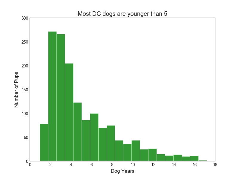
Dogs in DC are also on the younger side, as on this chart (measured in people years).
The data on who the dogs are in DC comes from a dataset FOIA’d and compiled by the great Kate Rabinowitz.
Hopefully, this has been a good excuse for you to go out and pet a pup!