Voting with their Tax Returns
Find the full code and data for this project at GitHub here.
In thinking about the 2016 election, I had a relatively simple question: did Hillary Clinton win among taxpayers? I started with the logic that Clinton won about 3 million more popular votes in the general election than Donald Trump, and used tax returns as a window into the ways that the areas Trump won are different from the areas Clinton won.
If you took all 3,113 counties in the United States, and wanted to try and guess whether a county would cast more votes for Hillary Clinton or Donald Trump, the most important pieces of information to have be the number of people who claim an education-related deduction or credit.
This finding on student loans is part of my ongoing analysis of the intersection of 2016 voting behavior and tax return information.
This analysis was performed using a random forest classifier, which used 124 variables drawn from county-level 2014 IRS data. Variables included aggregate totals and participant counts for each income type and deduction. The dataset was matched by county with the New York Times report of election night votes. Average cross-validated accuracy score using the model’s classification was approximately 0.89 (good!) and an F1 score of 0.88 (not bad!).
Here’s the full output of this classifier after performing a train-test split on the data and evaluating the resulting confusion matrix.
RandomForestClassifier(bootstrap=True, class_weight=None, criterion='gini',
            max_depth=None, max_features='auto', max_leaf_nodes=None,
            min_impurity_split=1e-07, min_samples_leaf=1,
            min_samples_split=2, min_weight_fraction_leaf=0.0,
            n_estimators=10, n_jobs=1, oob_score=False, random_state=None,
            verbose=0, warm_start=False)

Accuracy Score:	0.89


Cross Val Scores: [ 0.86538462  0.88782051  0.89423077  0.90996785  0.90996785  0.90032154
  0.88424437  0.87459807  0.87459807  0.86173633]

Avg cross val: 0.886286998104

Predicted Totals:
class 0: 2623
class 1: 490

Confusion Matrix:
          Predicted 1  Predicted 0
Actual 1           52           71
Actual 0           15          641

Classification Report:
              precision    recall  f1-score   support

Clinton Lose       0.90      0.98      0.94       656
 Clinton Win       0.78      0.42      0.55       123

 avg / total       0.88      0.89      0.88       779
To be sure, these groups of voters are qualitatively different in other measurable ways. For instance, the number of farm returns in a county is the next-most impactful feature in the income dataset behind education credits and deductions. Counties with the highest numbers of these returns were the most likely in the data to cast more returns for Trump than Clinton.
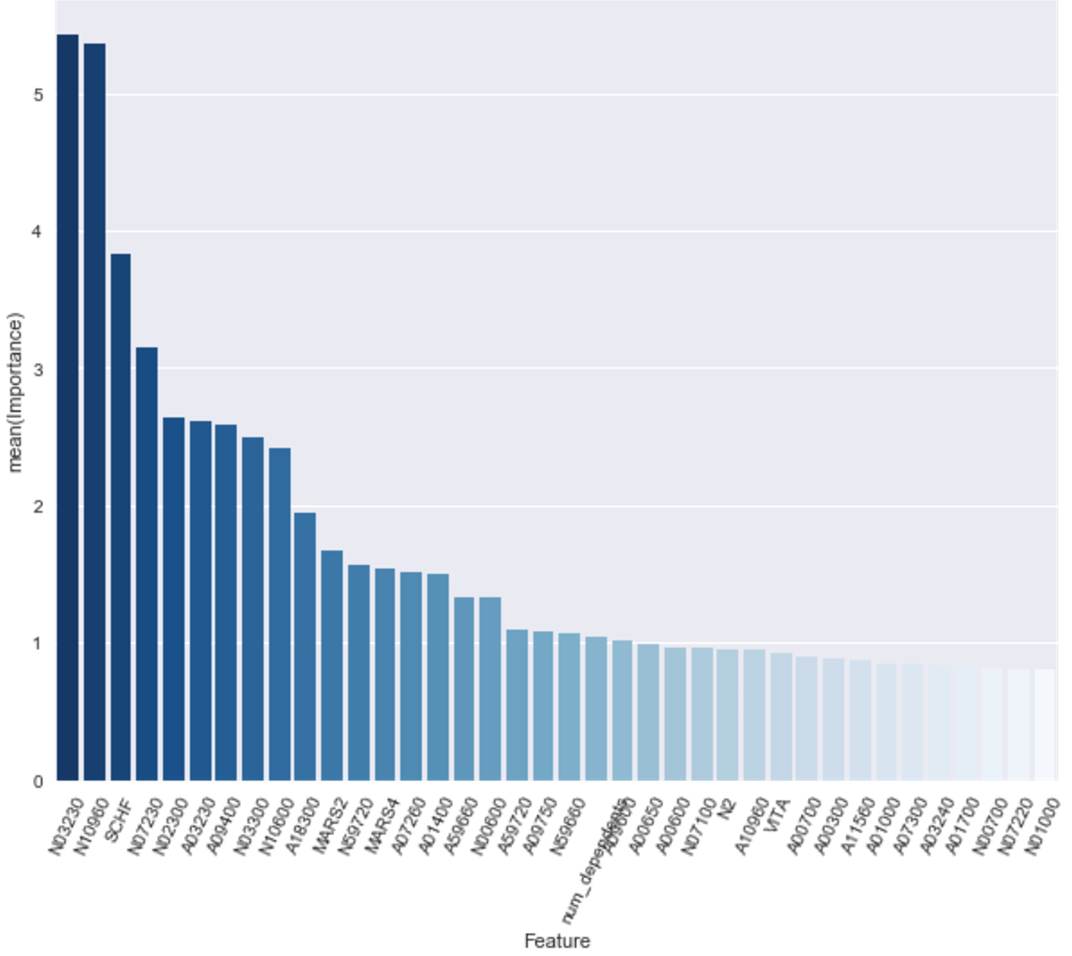
The feature ids here don’t mean much, but four in the top six in terms of importance are related to paying for education.
| Feature ID | Importance | Description |
|---|---|---|
| N03230 | 0.054240 | Number of returns with tuition and fees deduction |
| N10960 | 0.053645 | Number of returns with refundable education credits |
| SCHF | 0.038331 | Number of farm returns |
| N07230 | 0.031493 | Number of returns with nonrefundable education expenses |
| N02300 | 0.026453 | Number of returns with unemployment compensation |
| A03230 | 0.026133 | Tuition and fees deduction amount |
| A09400 | 0.025870 | Self-employment tax amount |
But these findings largely conform to the behaviors we might expect of the electorate. Those with higher levels of education (especially those at high-cost liberal arts colleges) are most likely to inhabit counties that vote for Clinton. Farmers were more likely to vote Trump.
Perhaps more interesting are the distinctions that weren’t found in the dataset. Most importantly, total taxable income did not emerge as an especially valuable predictor.
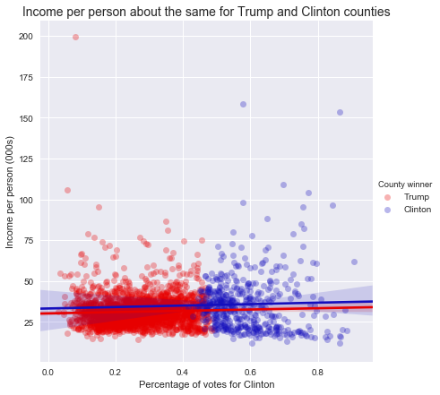
The figure above demonstrates the distribution of income, as separated by Clinton’s margin over Trump (or vice versa). Each blue dot represents a county in which more people voted for Clinton than Trump, and each red dot shows a county with more Trump votes.
While the sheer numbers for the Trump voters are significantly greater - Trump won about 84 percent of US counties - the distribution of incomes is relatively similar between them.
Of the counties that had the highest proportion of votes for independent candidates, 12 of the top 15 are in Utah (the other three are in Idaho), likely a function of the independent candidacy of Evan McMullin, a member of the Mormon church in Utah.
Counties with the highest total gross income per capita include a small town of 499 voters in Texas called McMullen, of whom Trump won 454 votes. Manhattan, NY also cracks the top 3, and voted for Clinton with 87 percent of the vote. The poorest counties also voted heavily for Clinton. Three counties on South Dakota reservations, and one county in Mississippi all voted for her by margins of at least 3-to-1.
A short note on methodology and assumptions:
- Income calculations is based on IRS county-level data from taxes filed for the year 2014 (those typically due by April 15, 2015).
- Taxpayer-level calculations were conducted by assuming that within a county, taxpayers and non-taxpayers voted at the same rate. Thus, to find the number of taxpayers voting for Clinton within a county, this analysis multiplied Clinton’s margin in that county by the total number of tax returns for the county.